P1racenews AI automatic summary:
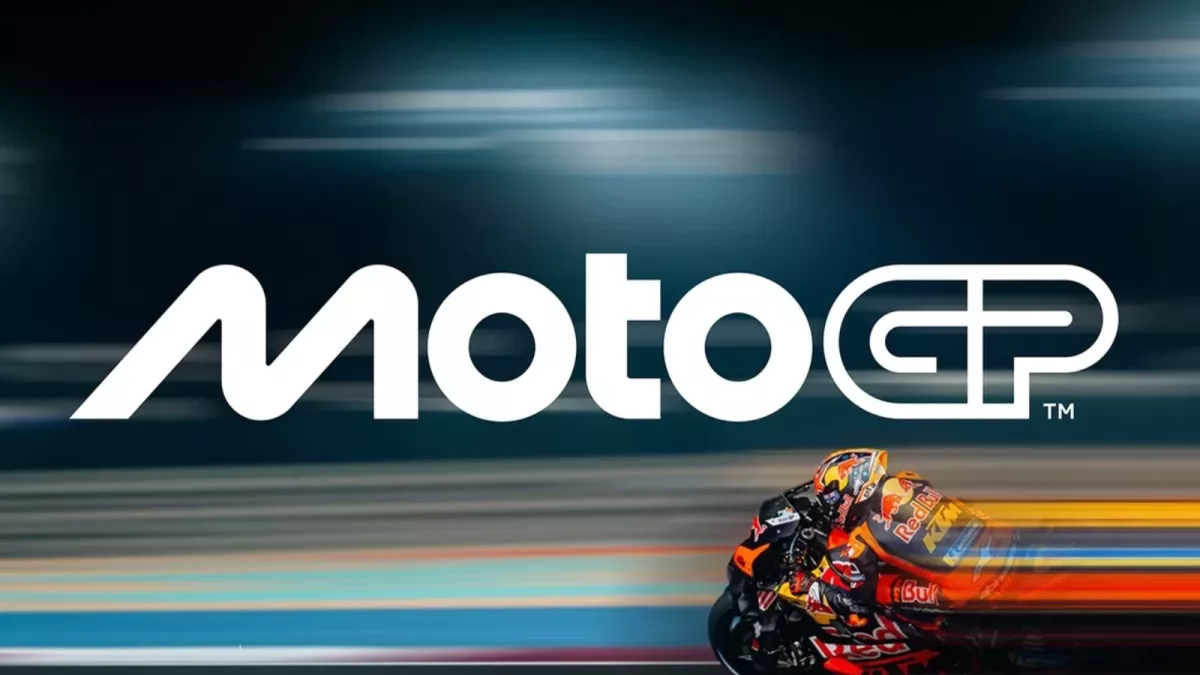
MotoGP has unveiled its new logos as the championship updates its brand identity following the 2024 season conclusion in Barcelona.
The new logo for MotoGP was unveiled at the post-season gala at the National Art Museum of Catalonia, featuring a voiceover by Emilia Clarke and a video setting the stage for a new era. Designed by Pentagram, it is the first major logo change since 2007 and the biggest update since the championship’s rebranding in 2002. The logo was leaked in black and white before the season finale due to EU trademark policies but officially launched later. The design signifies key elements of motorcycle racing, with the M showcasing bikes, the Os symbolizing tires, and the T representing the rider. Notably, the new logo removes the chequered flag, a longstanding feature, and the typography resembles the Women’s Motorcycling World Championship. MotoGP’s design shift has drawn parallels to Formula One, possibly due to its ownership by Liberty Media, prompting similar reactions from fans. The change also extends to Moto2, Moto3, and MotoE logos in preparation for a revamp leading up to the 2025 season, reflecting an exciting time for MotoGP according to Dorna CEO Carmelo Ezpeleta.
