P1racenews AI automatic summary:
MotoGP is celebrating its 75th anniversary by requiring every team to run a ‘retro’ livery at the British GP at Silverstone. Now that all 12 designs have been revealed, we asked The Race Media’s creative lead Oliver Card for his verdict on whether they truly lived up to the brief
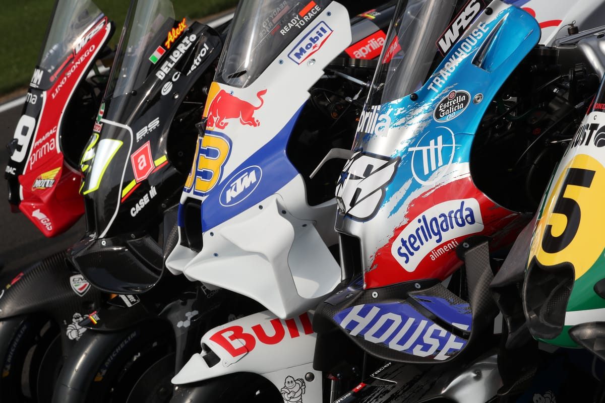
Every MotoGP team will showcase a ‘retro’ livery for the upcoming British Grand Prix at Silverstone to mark the series’ 75th anniversary. The Race Media’s creative lead, Oliver Card, will be at Silverstone recording a special MotoGP Extra podcast for The Race Members’ Club, evaluating each team’s livery. The concept of mixing retro aesthetics with modern sponsors and aero shapes is a delicate balance that impacts both fan sentiment and commercial exposure in motorsport. This weekend at the British GP, all MotoGP teams are embracing retro-inspired liveries for the first time, creating a visually dynamic grid that challenges commentators. While some liveries in the paddock have been hailed as stunning, others appear to lack depth in their interpretation of the retro brief. Notably, Yamaha’s choice of a classic red colour scheme for its retro livery pays homage to its early 1970s glory days, demonstrating a thoughtful blend of nostalgia and modern design elements. On the other hand, Repsol’s Honda livery reflects a historical tribute to Freddie Spencer’s iconic 1983 500cc title-winning bike, showcasing a sleek fusion of past and present aesthetics amidst rumors of Repsol ending its Honda sponsorship.